Wednesday, October 20, 2010

Typographic Revival

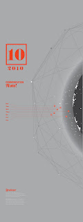
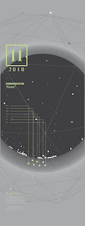
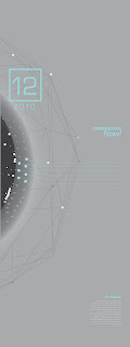
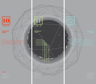
I just finished a recent experimental piece where the idea was to take three somewhat outdated typefaces, in this case I chose Fraktur, Perpetua and Eurostile; and to revive them for a contemporary audience. So I decided to create an info-graphic piece that ties all three pieces together in to. However, at the same time, each piece is able to function as a poster on its own.
The final output was a printed piece.
Here's my link to Behance.


Tuesday, October 5, 2010

I'm Back!


Yes I've been somewhat M.I.A for, well, the whole part this summer. But I'm back, temporarily. Thesis has begun at OCAD so I've got my hands full with that for now. To give you a peak of what's to come here's the title for my thesis "Spatial Kinetics in Communication". Where it goes no one knows but exciting times indeed!
In the mean while, I know I was suppose to post up an earlier project, which I'll have to get around to doing. For now though, here's a look at a recent project I did for a friend. First time using a tablet and I must say I rather enjoyed the process.

You can also follow me on my Behance page.
Enjoy!

Monday, April 19, 2010

I just got served.

I just found out today that Splinter was featured on Typography Served. It's an honour to have your work featured on such an amazing website- I'm a big fan of type served, keep up the good work guys!

Here's the link if anyone was wondering:

Sunday, March 21, 2010

What's Next?

I'm coming out with a zine titled "Inside Out". This is the type poster for the word mark of the zine. The zine's is a narrative about split personalities and will be coming soon, so keep a look out!

Introducing Splinter!

3D Typeface made from cut up pieces of board.


Splinter: Studio Setup

As a student you sometimes need to think out of the box when it comes to studio lighting that's not available when you need it. This was the set up I created for shooting my type.

Tuesday, March 9, 2010

Splinter: Prototype "A"

From my sketched out type, I decided that in wanting to create a typeface that would be reflective of war it would need to be real. Something you can actually walk up to and see for yourself, in person, what the type really looks like. So I created a model. Many have seen this and some of the many comments I’ve received have said it looks like a building or a bridge of some sort. Others actually took this to be either something out of Transformers or Sauron’s tower or even his helmet- which I thought was pretty cool! But no, this is the first prototype for A. It stands close to 23 inches high and is constructed out of triangular pieces of card.

Splinter: The Beginning


The design brief in my Type 4 class asked us to create a typeface that would in someway be reflective of war. Any war. I took into consideration war as conflict and tried to understand it form different prespectives. What it would be like from the point of view of a solider, a fighter, an innocent civilian, a journalist, or even a war-time photographer. Form that I began to analyse moods and the atmosphere that encapsulates any war which led to the creation of Splinter. This is Splinter in it’s earliest form. Stage two, coming soon!

Saturday, February 20, 2010

Limited Edition OCAD Silkscreen Shirt


To kick things off, I want to dedicate the very first post to my dear friend Moshik Nadav. During the few months he spent at OCAD (Ontario College of Art& Design) I came to learn a lot from him and have come to be greatly inspired by him and his work. He's like a brother to me, and his presence is dearly missed in Toronto and OCAD. Because he had to leave I decided to create a limited edition OCAD inspired t-shirt, as something for him to remember the good days. So, with the help of our friend Helen, we did a silkscreen of a logo I had made, and on the reverse, had as many of our friends sign it with their own little personal messages (which were also silkscreened). The final result looked quite cool.

Best of luck back home Moshik. Hope to see you soon.